INDUSTRY:
BANKING AND FINANCE
TIMEFRAME:
8 WEEKS (PART-TIME)
ROLE:
UI/UX DESIGNER
TOOL:
FIGMA
Designing a mobile app to apply for, manage and track credit cards
overview.
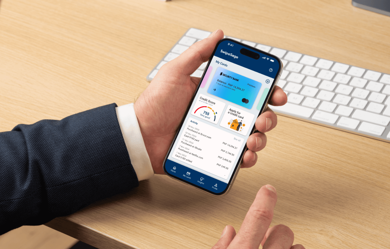
SwipeSage: Simplifying how you choose and manage credit cards
SwipeSage reimagines the credit card experience by combining application, tracking, and education into one intuitive mobile platform. Designed for users new to credit or managing multiple cards, it tackles the frustration of scattered information, jargon-heavy content, and missed payments. Through simplified visuals, minimal manual input, and smart reminders, the app helps users make informed decisions with confidence. The result? A streamlined user flow with 100% task success in testing and a design that transforms financial stress into clarity.
For this project, I led the end-to-end UI/UX process, from research, wireframing and prototyping in Figma, to user testing. It was designed as part of the Google UX Design Professional Certificate on Coursera, where I applied the full design process to solve a real-world financial challenge. This was completed part-time over eight weeks, with each phase developed in parallel with the topics covered in the Google course.
problem.
SwipeSage seeks to address two core challenges:
For new users, choosing the right credit card can feel overwhelming. With scattered, jargon-filled information and no centralized way to compare options based on lifestyle or financial goals, many users struggle to make confident decisions, sometimes avoiding credit cards altogether.
For users juggling multiple credit cards, managing expenses across different providers can be challenging. Without a clear system in place, this often leads to missed or late payments, putting their credit scores and long-term financial goals at risk.
Problem statements
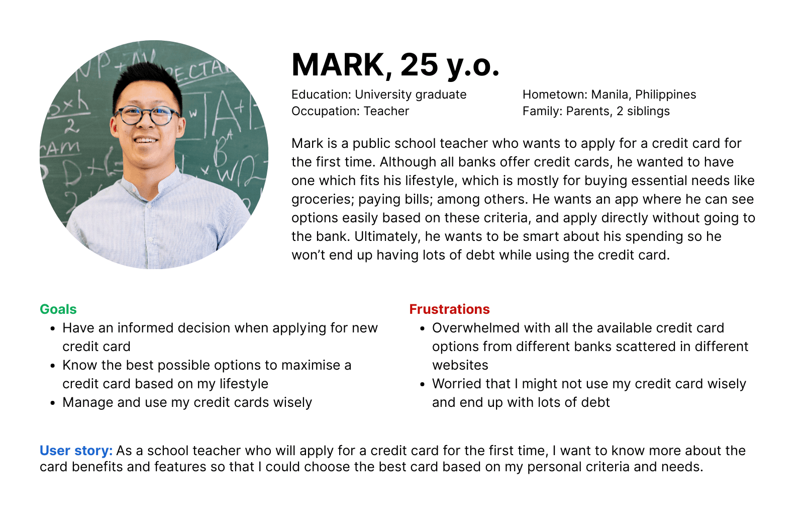
First time credit card applicants need to choose credit cards easily based on their lifestyle because feeling informed and in control helps them start their financial journey with confidence, not fear or confusion.
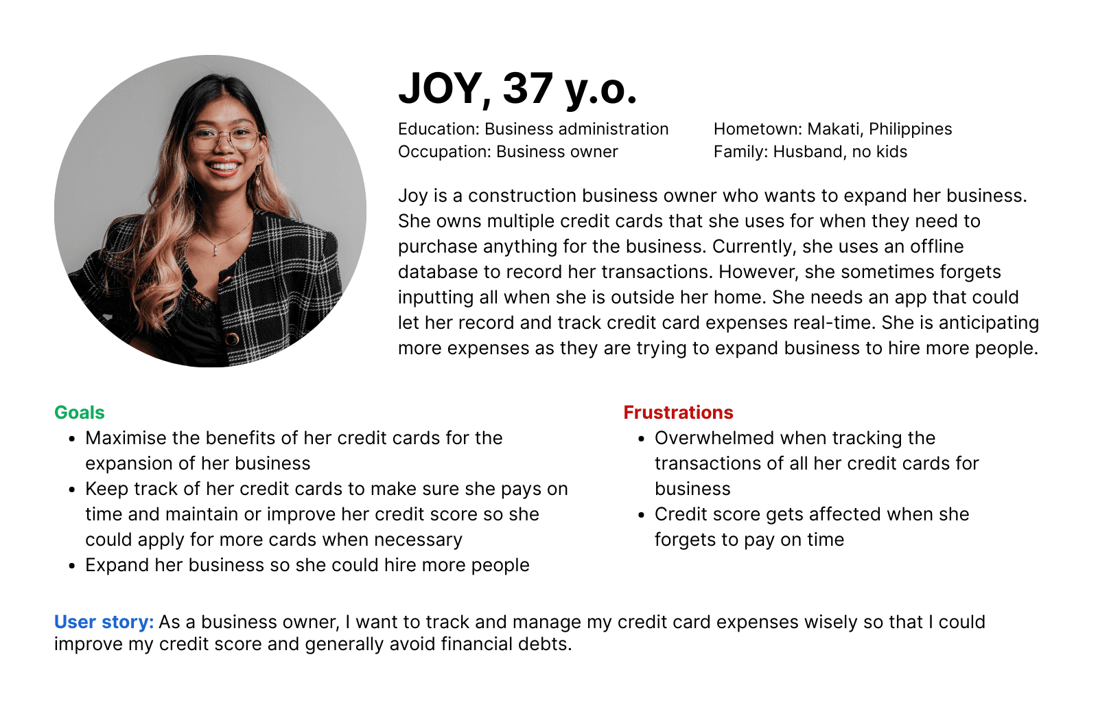
Multiple credit card users need to organize and track expenses and due dates because staying in control of their finances reduces stress, improves credit health, and frees up mental space to focus on personal goals.
research.
Based on the problems identified, I formulated some HMW questions:
How might we…
help first-time applicants confidently choose and apply for the right credit card through a simple and intuitive experience?
design a personalized selection process that matches users with credit cards based on their lifestyle, goals, and spending habits?
help multiple card users organize and track her credit card expenses in a way that feels effortless and stress-free?
support users in avoiding late payments through timely, non-intrusive reminders?
support users in building and maintaining a healthy credit score?
Research methods
To answer these questions, I used a combination of user personas, user stories and user flows to understand user needs and behaviors.
I created user personas that state their goals and frustrations on credit card application and management.
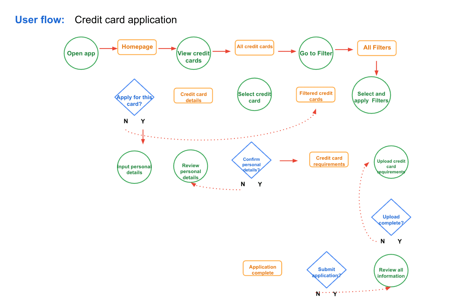
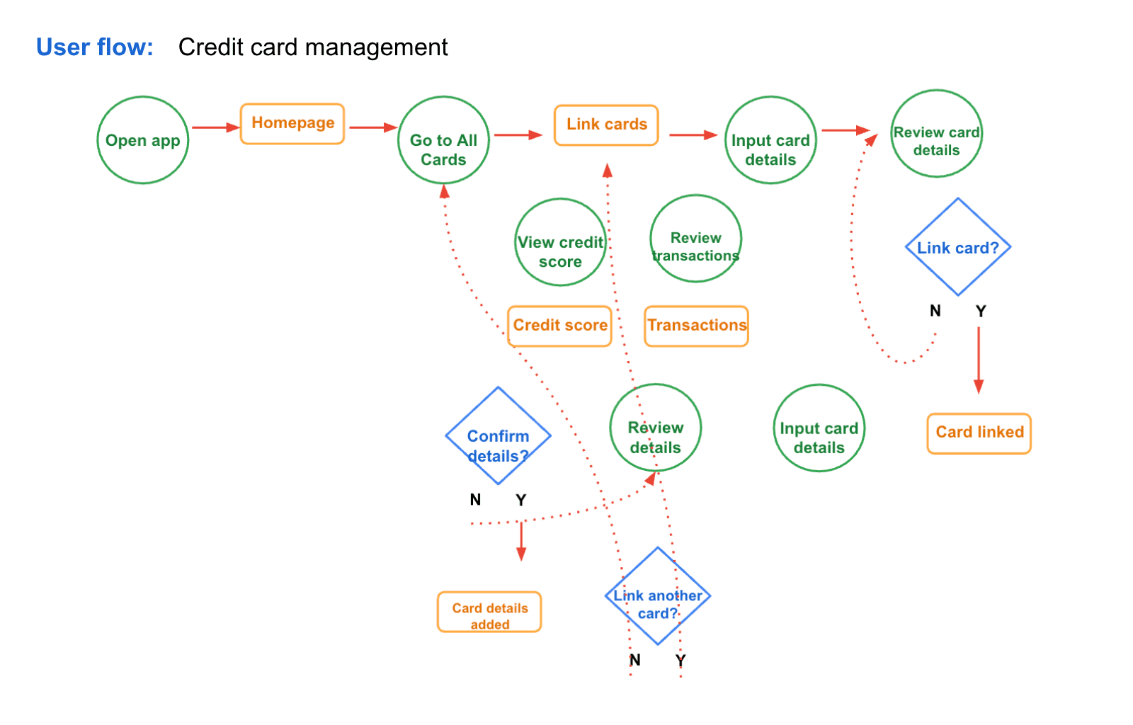
I created user flows for the two main features, i.e. credit card application and credit card management.
Key user research insights
From the research, three core themes emerged:
Personalization reduces overwhelm: Users struggle with too many generic options and crave tools that help them filter credit cards based on personal needs or lifestyles.
Clarity builds confidence: Long, jargon-heavy text creates friction. Users are drawn to visual, simplified explanations that help them understand benefits quickly.
Organization prevents stress: Users with multiple cards often feel mentally overloaded. They need an intuitive way to track payments, spending limits, and rewards to stay financially healthy.
Impact on design
These insights directly shaped my design approach. I prioritized simplicity, visual clarity, and reduced financial jargon to make the app more approachable. A mobile-first design was emphasized to ensure accessibility and convenience for users managing credit on the go.
design.
Each major insight from the user research directly influenced my design decisions:
Personalization → Use card filtering by lifestyle (e.g., travel, cashback, rewards) to help users find relevant options quickly.
Clarity → Use icons, infographics, and visual breakdowns instead of text-heavy descriptions to present card benefits in a digestible way.
Organization → Create a swipe-based interface where users can easily browse through all their added credit cards, view key details for each one and pay as desired
Behavioral support → Add simplified credit tips to guide users toward healthy habits without overwhelming them.
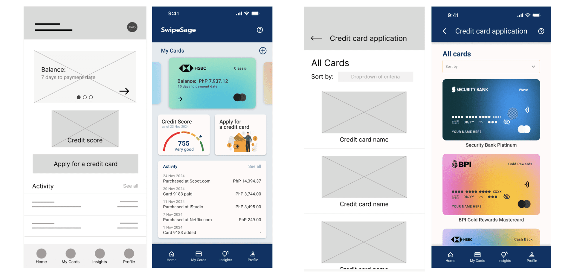
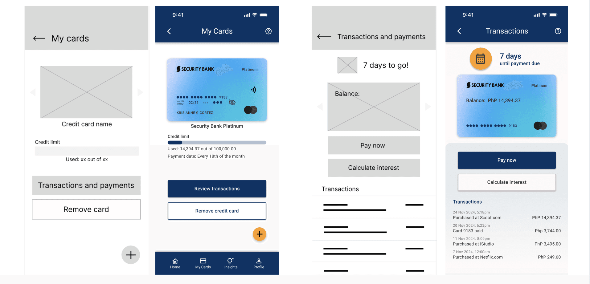
The navigation focused on two user flows: selecting and applying for the right card and tracking existing ones. Since this was my first UI/UX design project, I used clean UI components using Material Design.
With the insights feeding my design decisions, I explored various features and sketched some possible components and how they could be placed on mobile screen.
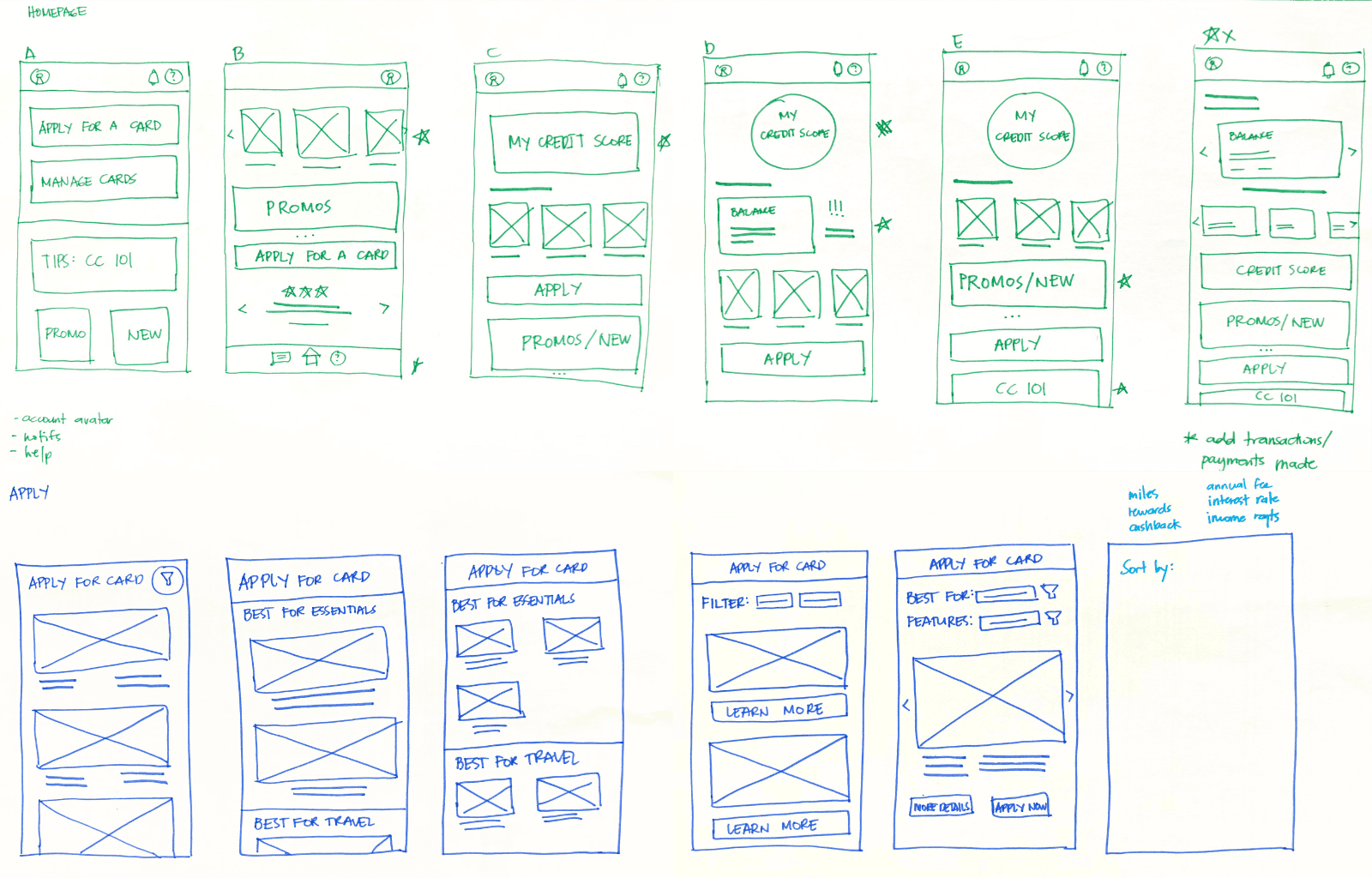
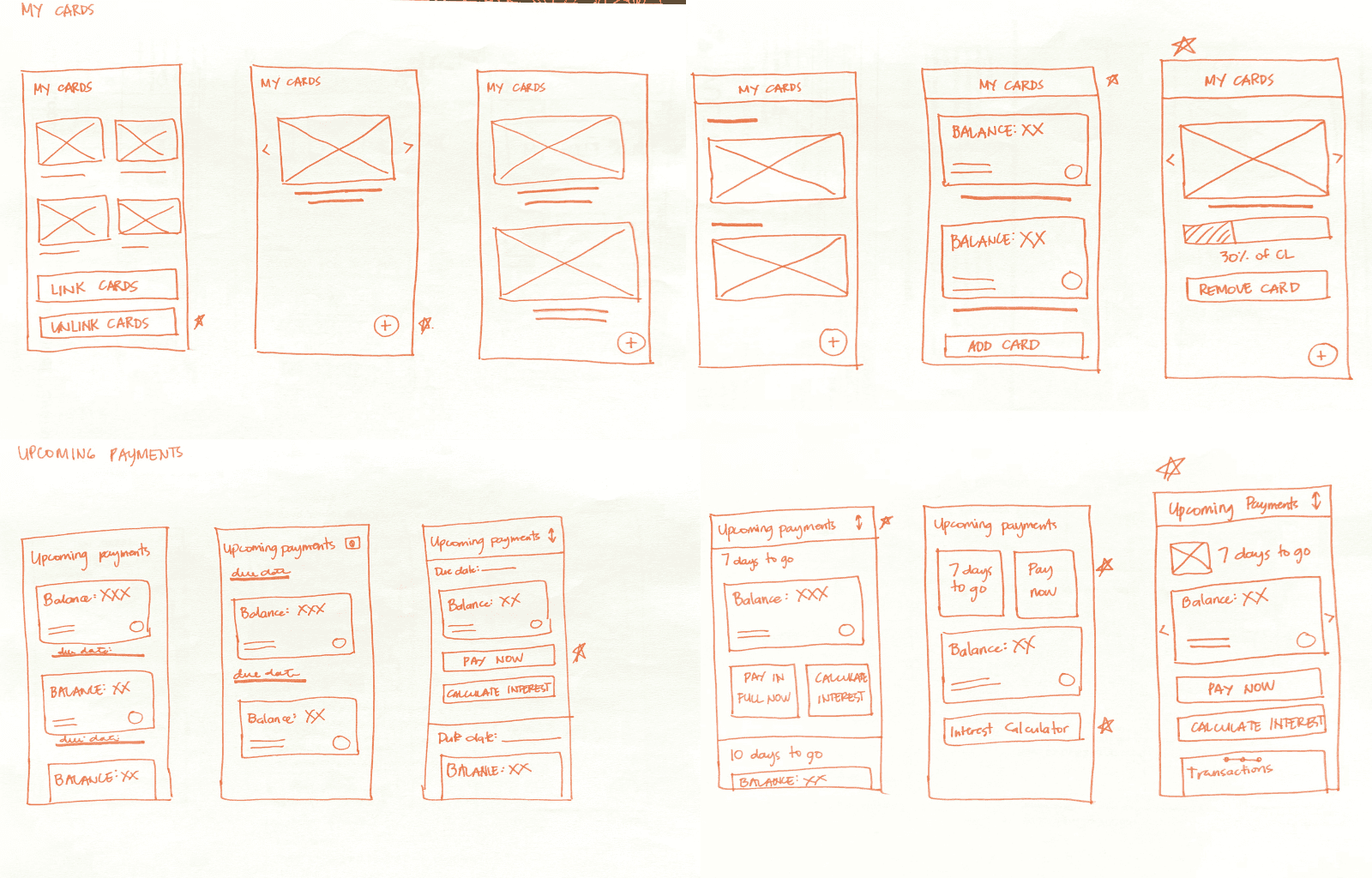
After finalizing the design for each key screen, I created low-fidelity wireframes on Figma, which were later turned into mockups. Below are samples of lo-fi wireframes turned to mockups.
User testing
Conducted with 5 users (3 moderated, 2 unmoderated). After the first user testing, the following outcomes were noted:
Credit card application: 5/5 users easily applied for a credit card using their selected filters, indicating strong usability and clarity in the application flow.
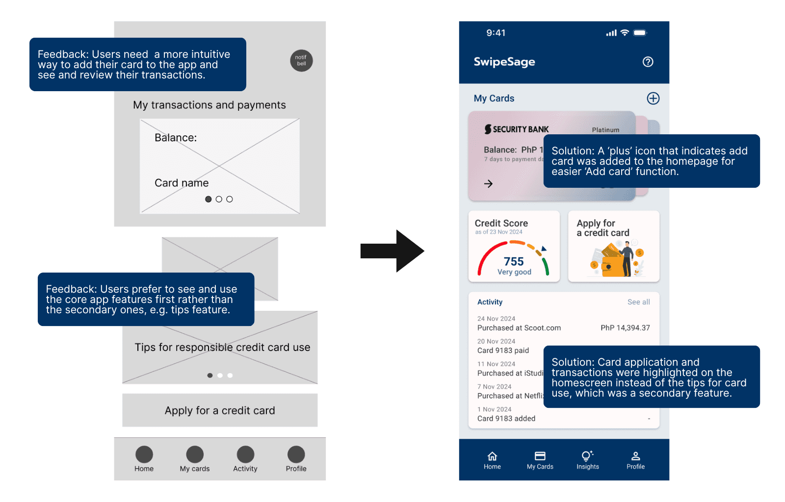
Transactions and payments access: 3/5 users struggled to locate the transactions and payments feature on the home screen, suggesting it needs better visibility or placement.
Add card flow: 2/5 users were slow to find the button for adding card details, indicating the feature could be more intuitive or better labeled.
Home screen tips placement: 2/5 users questioned the placement of tips on the home screen, suggesting the content may feel out of context or disruptive.
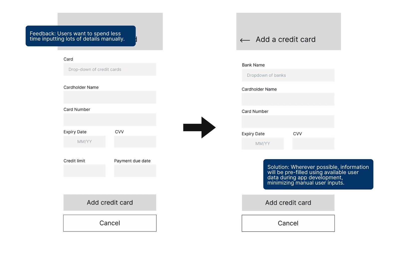
Navigation and input fields: 2/5 users experienced friction while navigating and entering details, highlighting the need to simplify forms and streamline interaction flows.
Key user testing insights
Based on the user tests conducted, the following insights have been identified:
Users need a more intuitive way to access the transactions and payments feature.
Users need a more intuitive way to access the add card feature.
Users want to see core features or tasks first than other secondary features.
Users need to navigate the app more easily and spend less time inputting details that can be automated.
Users are satisfied with the current journey when applying for a new credit card.
Iterations
Based on the user testing insights, the following iterations were done to improve user experience:
Minimized manual inputs: Reduced user effort by pre-filling fields with available bank-linked data where possible.
Improved transactions and payments access: Redesigned layout for clearer visibility and faster access to transactions and payments from the home screen.
Refined tips feature: Repositioned tips as a secondary feature; removed from prominent CTA placement on the homepage to reduce visual clutter.
Based on the user testing feedback, I made key iterations to further simplify and make SwipeSage more intuitive.
results.
After the design iterations, user testing showed a 100% task success rate for both key user flows. Participants described the experience as “intuitive” and “easy to do,” with simplified card breakdowns and filters helping them clearly understand benefits and make informed decisions.
Impact on users
The final design could increase user confidence in applying for and managing credit cards. Organized financial tracking could help to reduce anxiety, while clearer explanations of credit behavior could empower users to understand and improve their credit scores.
Impact on product vision
The project has the potential to validate the need for a centralized, human-centered credit management tool, suggesting a strong market opportunity for a product that balances usability with financial clarity. Insights from the design process could lay the groundwork for future scalability, including integrations like real-time bank syncing, credit score APIs, and personalized financial insights. This approach positions SwipeSage as more than just a comparison tool, with the potential to become an everyday financial companion. It also opens up possibilities for monetization through affiliate partnerships, premium user features, or white-label solutions for fintech providers.
Lessons learned
Building trust in financial tools requires a careful balance of clarity, simplicity, and empathy. Users consistently valued straightforward, actionable features over complexity, they wanted fast, functional results without cognitive overload. Streamlined, purpose-driven design led to stronger engagement, and early feedback proved critical in identifying blind spots in user flows, copy, and feature priorities—highlighting the importance of iterative design.
Areas for future improvement
Add card comparison screen
Integrate real-time credit score APIs and bank feeds
Ensure timely alerts for payments and budget thresholds post-dev
Build responsive web version